
Diabetes is a chronic medical condition that affects millions of people worldwide. The management and prediction of diabetes are critical for improving patient outcomes. In this blog, we'll explore the Diabetes dataset, a classic dataset used in machine learning, to predict the onset of diabetes based on diagnostic measures. We'll use Python and its powerful data science libraries to analyze and model this data.

Diabetes Dataset with Python
The Diabetes dataset, also known as the Pima Indians Diabetes dataset, consists of 768 observations of female patients of Pima Indian heritage. The dataset includes several medical predictor variables and one target variable, indicating whether a patient has diabetes. The features include:
Pregnancies: Number of times pregnant
Glucose: Plasma glucose concentration
BloodPressure: Diastolic blood pressure (mm Hg)
SkinThickness: Triceps skinfold thickness (mm)
Insulin: 2-Hour serum insulin (mu U/ml)
BMI: Body mass index (weight in kg/(height in m)^2)
DiabetesPedigreeFunction: Diabetes pedigree function
Age: Age (years)
Outcome: Class variable (0 if non-diabetic, 1 if diabetic)
Loading the Dataset
First, we'll load the dataset using the pandas library, which is commonly used for data manipulation and analysis in Python.
import pandas as pd
# Load the dataset
df = pd.read_csv('https://raw.githubusercontent.com/jbrownlee/Datasets/master/pima-indians-diabetes.data.csv', header=None)
df.columns = ["Pregnancies", "Glucose", "BloodPressure", "SkinThickness", "Insulin", "BMI", "DiabetesPedigreeFunction", "Age", "Outcome"]
# Display the first few rows
print(df.head())
Output of the above code:
   Pregnancies  Glucose  BloodPressure  SkinThickness  Insulin   BMI  \
0            6      148             72             35        0  33.6
1            1       85             66             29        0  26.6
2            8      183             64              0        0  23.3
3            1       89             66             23       94  28.1
4            0      137             40             35      168  43.1

   DiabetesPedigreeFunction  Age  Outcome
0                     0.627   50        1
1                     0.351   31        0
2                     0.672   32        1
3                     0.167   21        0
4                     2.288   33        1
Data Exploration and Visualization
Understanding the distribution and relationships between features is essential. Let's explore the data through descriptive statistics and visualizations.
Descriptive statistics in pandas
Descriptive statistics in pandas provide a quick summary of the central tendency, dispersion, and shape of a dataset's distribution. By using the .describe() method, you can obtain key statistics such as mean, median, standard deviation, minimum, and maximum values for numerical columns. This summary helps in understanding the data's overall distribution and identifying any potential anomalies or outliers.
import seaborn as sns
import matplotlib.pyplot as plt
# Summary statistics
print(df.describe())
Output of the above code:
       Pregnancies     Glucose  BloodPressure  SkinThickness     Insulin  \
count   768.000000  768.000000     768.000000     768.000000  768.000000
mean      3.845052  120.894531      69.105469      20.536458   79.799479
std       3.369578   31.972618      19.355807      15.952218  115.244002
min       0.000000    0.000000       0.000000       0.000000    0.000000
25%       1.000000   99.000000      62.000000       0.000000    0.000000
50%       3.000000  117.000000      72.000000      23.000000   30.500000
75%       6.000000  140.250000      80.000000      32.000000  127.250000
max      17.000000  199.000000     122.000000      99.000000  846.000000

              BMI  DiabetesPedigreeFunction         Age     Outcome
count  768.000000                768.000000  768.000000  768.000000
mean    31.992578                  0.471876   33.240885    0.348958
std      7.884160                  0.331329   11.760232    0.476951
min      0.000000                  0.078000   21.000000    0.000000
25%     27.300000                  0.243750   24.000000    0.000000
50%     32.000000                  0.372500   29.000000    0.000000
75%     36.600000                  0.626250   41.000000    1.000000
max     67.100000                  2.420000   81.000000    1.000000
Pairplot in Seaborn
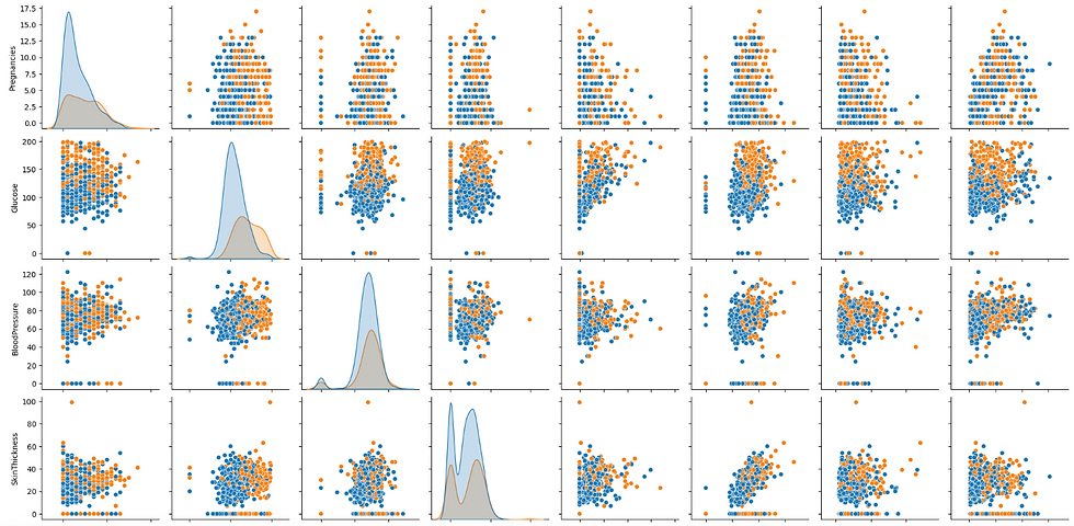
A pairplot in Seaborn is a powerful visualization tool that creates a grid of scatter plots for each pair of features in a dataset, along with histograms for each feature. It helps in visualizing the relationships and distributions between multiple variables, making it easy to detect patterns, correlations, and potential outliers. Additionally, pairplots can include different hues to distinguish between categorical outcomes, providing deeper insights into data separation based on classes.
# Pairplot to visualize relationships
sns.pairplot(df, hue='Outcome')
plt.show()
Output of the above code:
Correlation heatmap in seaborn
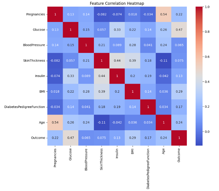
A correlation heatmap in Seaborn is a visual representation of the correlation matrix of numerical features in a dataset. It uses color gradients to indicate the strength and direction of relationships between variables, with darker or lighter shades showing stronger correlations. This tool helps quickly identify highly correlated features, which can be useful for feature selection and understanding the data's structure.
# Correlation heatmap
plt.figure(figsize=(10, 8))
sns.heatmap(df.corr(), annot=True, cmap='coolwarm')
plt.title('Feature Correlation Heatmap')
plt.show()
Output of the above code:
Data Preprocessing in Python
Before modeling, we need to handle missing values and scale the features. Missing values in the dataset are represented by zeros in some features, which is not realistic for medical measurements.
Data Clearning & preprocessing in sklearn
Data preprocessing in scikit-learn involves transforming raw data into a format suitable for modeling. It includes tasks such as handling missing values, scaling features to ensure they have similar ranges, and encoding categorical variables into numerical formats. Effective preprocessing is crucial for improving model performance and ensuring accurate predictions.
from sklearn.model_selection import train_test_split
from sklearn.preprocessing import StandardScaler
import numpy as np
# Replace zero values with NaN for specific columns
columns_to_replace = ["Glucose", "BloodPressure", "SkinThickness", "Insulin", "BMI"]
df[columns_to_replace] = df[columns_to_replace].replace(0, np.nan)
# Fill NaN values with column means
df.fillna(df.mean(), inplace=True)
# Split the data into training and testing sets
X = df.drop('Outcome', axis=1)
y = df['Outcome']
X_train, X_test, y_train, y_test = train_test_split(X, y, test_size=0.2, random_state=42)
# Scale the features
scaler = StandardScaler()
X_train = scaler.fit_transform(X_train)
X_test = scaler.transform(X_test)
Building a Classification Model - Logistic Regression
We'll build a classification model using Logistic Regression, a simple yet effective algorithm for binary classification tasks.
Logistic Regression in sklearn
Logistic Regression in scikit-learn is a popular algorithm for binary classification tasks, predicting probabilities of class membership using a logistic function. It models the relationship between features and the binary target variable through a linear decision boundary.
from sklearn.linear_model import LogisticRegression
from sklearn.metrics import classification_report, accuracy_score
# Initialize and train the model
model = LogisticRegression(random_state=42)
model.fit(X_train, y_train)
# Make predictions on the test set
y_pred = model.predict(X_test)
Model Evaluation in sklearn
The scikit-learn classification report provides detailed performance metrics for a classification model, including precision, recall, F1-score, and support for each class. Precision measures the accuracy of positive predictions, recall assesses the model's ability to identify all relevant instances, and the F1-score balances precision and recall. The support indicates the number of true instances for each class, providing context for the metrics.
# Evaluate the model
accuracy = accuracy_score(y_test, y_pred)
print(f'Accuracy: {accuracy * 100:.2f}%')
# Classification report
print(classification_report(y_test, y_pred))
Output of the above code:
Accuracy: 75.32%
              precision    recall  f1-score   support

           0       0.80      0.83      0.81        99
           1       0.67      0.62      0.64        55

    accuracy                           0.75       154
   macro avg       0.73      0.72      0.73       154
weighted avg       0.75      0.75      0.75       154
Feature Importance and Model Interpretation
Feature importance helps in understanding the contribution of each feature to the model's predictions. While Logistic Regression coefficients provide a sense of feature importance, other models like Random Forests offer a clearer picture.
# For logistic regression, feature importance can be inferred from the coefficients
coefficients = pd.DataFrame({"Feature": X.columns, "Coefficient": model.coef_[0]})
coefficients['Absolute Coefficient'] = coefficients['Coefficient'].abs()
coefficients = coefficients.sort_values(by='Absolute Coefficient', ascending=False)
# Display feature importance
print(coefficients)
Output of the above code:
                    Feature  Coefficient  Absolute Coefficient
1                   Glucose     1.083488              1.083488
5                       BMI     0.679410              0.679410
7                       Age     0.394747              0.394747
0               Pregnancies     0.224880              0.224880
6  DiabetesPedigreeFunction     0.199964              0.199964
2             BloodPressure    -0.145412              0.145412
4                   Insulin    -0.097142              0.097142
3             SkinThickness     0.068521              0.068521
Alternatively, use Random Forest for feature importance
In sklearn, Random Forest can be used to assess feature importance by measuring how much each feature contributes to reducing impurity across all trees in the forest. This is done through aggregating the decrease in the Gini impurity or entropy for each feature across the ensemble of decision trees. Feature importance values from a Random Forest model can help identify which features are most influential in making predictions.
from sklearn.ensemble import RandomForestClassifier
# Train a Random Forest model
rf_model = RandomForestClassifier(random_state=42)
rf_model.fit(X_train, y_train)
# Get feature importances
importances = rf_model.feature_importances_
indices = np.argsort(importances)[::-1]
# Print feature importance ranking
print("Feature ranking:")
for f in range(X_train.shape[1]):
print(f"{f + 1}. Feature {X.columns[indices[f]]} ({importances[indices[f]]})")
Output of the above code:
Feature ranking:
1. Feature Glucose (0.2574371360871144)
2. Feature BMI (0.16682723948882405)
3. Feature Age (0.131210912998538)
4. Feature DiabetesPedigreeFunction (0.11896641692795754)
5. Feature Insulin (0.09398375802944853)
6. Feature BloodPressure (0.08419015561804571)
7. Feature SkinThickness (0.07397265325818526)
8. Feature Pregnancies (0.0734117275918865)
Conclusion
In this blog, we delved into the Diabetes dataset, utilizing Python's powerful libraries to explore, preprocess, and model the data. We examined the dataset's characteristics, performed essential data cleaning, and built a Logistic Regression model to predict diabetes outcomes. Additionally, we discussed how Random Forests can reveal feature importance, enhancing our understanding of which factors most significantly influence predictions. This analysis demonstrates the potential of machine learning in healthcare, providing valuable insights that could lead to improved diagnostic tools and better management of diabetes. By leveraging these techniques, we pave the way for more accurate and effective medical decision-making.
Dive into the Diabetes dataset to experience firsthand how advanced algorithms can drive meaningful innovations in medical diagnostics.
Comments