
Data visualization plays a pivotal role in understanding trends, patterns, and insights hidden within vast datasets. As data-driven decision-making becomes increasingly crucial in various industries, mastering data visualization techniques is a valuable skill for professionals across the board. In this article, we delve into the world of Python and specifically focus on utilizing libraries like Matplotlib, pandas , plotly , bokeh & seaboarn to enhance your data visualization capabilities.

The Power of Python Programming
The power of Python programming lies in its simplicity, versatility, and vast ecosystem of libraries and frameworks. Python’s clean and readable syntax makes it an ideal language for beginners, while its robust capabilities cater to the needs of experienced developers. From web development with Django and Flask to data science with pandas and NumPy, Python’s applications are vast and varied. Its powerful machine learning libraries, such as TensorFlow and scikit-learn, are transforming industries by enabling advanced data analysis and predictive modeling. Additionally, Python's strong community support ensures a wealth of resources and continuous improvement. This combination of accessibility, functionality, and community makes Python a powerful tool for innovation and problem-solving across numerous domains.
Python Programming for Data Visualization
Python has emerged as a leading programming language for data science and visualization due to its simplicity, versatility, and extensive library support. Known for its readability and ease of use, Python provides an ideal platform for both novice and experienced data analysts to manipulate and present data effectively.
When it comes to data visualization, Python offers an array of libraries that streamline the process of creating insightful visuals. One such powerhouse library is Matplotlib. By leveraging Matplotlib's functionalities, users can generate a wide range of plots, charts, and graphs with precision and customization.
Python programming has revolutionized the field of data visualization, offering unparalleled power and flexibility to data analysts, scientists, and enthusiasts. With its extensive ecosystem of libraries, Python provides robust tools for transforming raw data into compelling visual narratives. Libraries such as Matplotlib, Seaborn, Plotly, and Bokeh enable the creation of a wide range of visualizations, from simple line graphs to complex interactive plots. Python’s seamless integration with data manipulation libraries like Pandas ensures that data preparation and visualization are part of a smooth, efficient workflow. The language's simplicity and readability make it accessible to beginners, while its depth and versatility cater to the needs of advanced users. Python's ability to generate clear, insightful visualizations not only aids in data exploration and analysis but also enhances the communication of data-driven insights, making it an indispensable tool in the data visualization toolkit.
Unleashing the Potential of Matplotlib
Matplotlib serves as a comprehensive plotting library that enables users to visualize data in 2D space. Whether you need to plot simple line graphs, intricate scatter plots, or complex histograms, Matplotlib equips you with the tools necessary to convey your data visually. One of Matplotlib's standout features is its flexibility in customization. From adjusting color schemes and markers to altering axis labels and plot styles, Matplotlib empowers users to tailor their visualizations to suit specific requirements. By mastering the art of customization, you can elevate your data visualizations from informative to captivating. While static plots serve their purpose, incorporating interactivity can take your visualizations to the next level. Matplotlib offers functionalities to create interactive plots, enabling users to zoom, pan, and interact with data points dynamically. By incorporating interactive elements, you can provide a more engaging and immersive experience for your audience. For datasets with geospatial components, Matplotlib offers solutions for creating geospatial visualizations. By plotting data on maps or geographic projections, you can unearth spatial patterns and relationships that may go unnoticed in traditional plots. Matplotlib's geospatial capabilities broaden the scope of data visualization, especially for projects involving geographical data analysis.
Taking Your Data Visualization Skills to the Next Level with Python Programming and matplotlib
Python, in conjunction with Matplotlib, presents an invaluable toolkit for mastering data visualization techniques. Whether you are a data scientist, analyst, researcher, or enthusiast, harnessing the power of Python and Matplotlib can unlock a world of possibilities in data representation and interpretation.
In conclusion, by honing your skills in Python programming and delving into the nuances of Matplotlib, you can transform raw data into compelling visual narratives. Embrace the art of data visualization, and let Python be your gateway to unlocking insights that drive informed decision-making.
Remember, the key to mastering data visualization lies not only in the technical aspects but also in the creativity and insight you bring to your visualizations. So, fire up your Python interpreter, import Matplotlib, and embark on a data visualization journey that transcends numbers and charts.
Mastering Data Visualization Rechniques with Python Programming
Mastering data visualization techniques with Python involves understanding and utilizing various libraries and tools to create informative and visually appealing charts and graphs. Here’s a guide to get you started:
Introduction to Data Visualization Importance: Helps in understanding data patterns, trends, and outliers. Types: Static vs. interactive, simple (bar, line, pie) vs. complex (heatmaps, geospatial).
Key Python Libraries for Data Visualization Matplotlib: The foundational library for creating static plots. Seaborn: Built on top of Matplotlib, provides a high-level interface for drawing attractive statistical graphics. Plotly: For creating interactive plots. Bokeh: Another library for interactive visualizations. Altair: Declarative statistical visualization library based on Vega and Vega-Lite. Pandas: Although primarily for data manipulation, it has built-in plotting capabilities.
Creating a basic plot with Matplotlib in Python
Creating a basic plot with Matplotlib in Python is a straightforward process that forms the foundation for more complex visualizations. To begin, you need to import the pyplot module from the Matplotlib library, commonly aliased as plt for convenience. The basic elements of a plot include defining the data points for the x and y axes, which can be provided as lists or arrays. Using the plt.plot() function, you can create a simple line plot by passing the x and y data. To enhance the readability of the plot, you can add labels to the axes using plt.xlabel() and plt.ylabel(), and give the plot a title with plt.title(). Finally, the plt.show() function is called to display the plot on the screen. This basic plotting capability allows users to quickly visualize data and is the first step towards creating more detailed and informative charts.

The output of the above code:

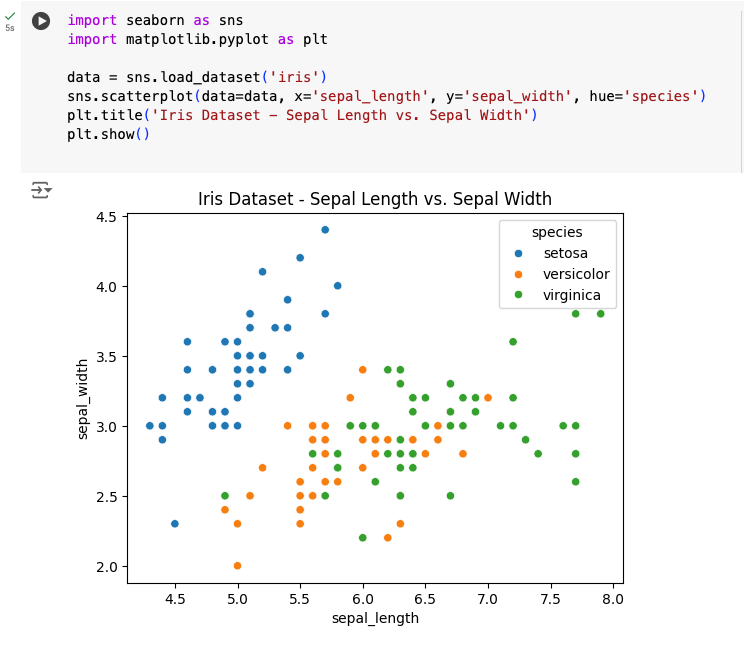
Creating a basic plot with seaborn in Python
Seaborn is a powerful Python visualization library built on top of Matplotlib, offering a high-level interface for drawing attractive and informative statistical graphics. To create a basic plot with Seaborn, you first need to install the library using pip install seaborn. Once installed, you can easily generate a variety of plots. For instance, to create a scatter plot, you can load a sample dataset such as the Iris dataset using sns.load_dataset('iris'). Then, use the sns.scatterplot() function to plot the data. For example, sns.scatterplot(data=data, x='sepal_length', y='sepal_width', hue='species') will create a scatter plot of sepal length against sepal width, with different species distinguished by color. Adding plt.title('Iris Dataset - Sepal Length vs. Sepal Width') provides a title for the plot, and plt.show() displays the plot. Seaborn simplifies the process of creating complex plots with its intuitive syntax and built-in themes, making it an essential tool for data visualization in Python.
Creating Interactive Plots with Plotly; Installation pip install plotly
Creating interactive plots with Plotly is a powerful way to bring data visualizations to life, offering a dynamic experience that goes beyond static images. Plotly is a versatile library in Python that allows for the creation of interactive charts and dashboards with ease. It supports a wide range of plot types, including scatter plots, line charts, bar charts, and more complex visualizations like 3D plots and geographic maps. By simply importing the library and using functions like plotly.express or plotly.graph_objects, users can quickly generate interactive graphs that allow for zooming, panning, and hover tooltips. These features enhance the user's ability to explore and analyze data in a more intuitive and engaging way. For example, with a few lines of code, one can create a scatter plot where hovering over data points reveals additional information, or a line chart that can be zoomed in to examine specific trends more closely. Additionally, Plotly integrates seamlessly with Jupyter notebooks and can be embedded in web applications, making it an excellent choice for data scientists and developers who want to present their findings in an interactive format. Overall, Plotly's ease of use and powerful interactive capabilities make it an indispensable tool for modern data visualization.

In conclusion, Mastering data visualization techniques with Python is a transformative skill for any data enthusiast, analyst, or scientist. By leveraging powerful libraries such as Matplotlib, Seaborn, Plotly, Bokeh, and Altair, you can turn complex datasets into clear, compelling visual stories that highlight trends, patterns, and insights. These visualizations not only enhance the comprehensibility of data but also facilitate better decision-making and communication of results. As you continue to explore and practice with these tools, you'll develop a deeper understanding of your data and the ability to convey its significance effectively. Whether you're creating static plots for reports or interactive dashboards for presentations, mastering these techniques will significantly elevate your data analysis capabilities and enable you to deliver impactful visual narratives. The journey of learning data visualization with Python is ongoing, with endless opportunities to innovate and refine your skills, ensuring you stay at the forefront of data science and analysis.
By blending the proficiency of Python programming with the versatility of libraries like seaborn, plotly, Matplotlib etc you can turn mundane datasets into captivating visuals that tell stories, unveil patterns, and inspire action. So, embrace the power of Python and Matplotlib, and embark on a journey of mastering data visualization techniques that elevate your data-driven decision-making to new heights.
Comments